Panoptic - Digital Assets Managed
In this project, I present a digital assets management platform that will help content-based and e-commerce website owners or managers combine all their services(Analytics, Newsletter, Leads, Affiliate, etc..) into one dashboard that will provide real-time data and insights.
UI UX & Branding & Frontend-developer
2020
Concept
The Challenge
The objective was to help website owners check their data easily. The big pain point of the owners and managers of digital assets is that each time they were to check the status of the assets they needed to login to each service individually and filter that data they get from the data they actually needed which creates huge frustration when it gets to checking 5-10 or even 50 digital assets.
The Solution
To find the best solution I conducted user interviews and published questionnaires in digital assets forums and groups. After getting to know my users I did my competitor's research and found the goods and bad on those platforms and services. I created a user journey map UX flow and different scenarios. created a features narrative, figured out the Nice to have and Must-have of the platform, and finally, I sketched different interaction patterns and got designer critiques. I came up with a digital assets management platform that will combine all services and data into one single customizable dashboard.
Discover
Competitive Research
I started my project by collection information about the competition to find if there is a solution to the
problem I faced.
from the competitor's research, I concluded that there isn't an existing solution to the exact need of my
users. however,
I did found some good user experience inspirations out of the platforms and services.
My main focus was the Register, Features, and widgets handling.
My direct competitors included
- AgencyAnalytics
- ManageWP
- Swydo
- MainWP
- InfiniteWP
Insights
The main focus of the competitors is marketing campaigns and budgets management.
Their target audience is mostly marketing and SEO managers.
They have a very limited variety of external services and API's
No real-time data nor insights.
Interviews
At the discovery phase of my project, I choose to interview 5 key people in this industry to get
a better understanding of their main problems with managing digital assets.
My guiding questions were:
- What are the main challenges in the field?
- Is there a real need for this kind of solution?
- Do you have any system that helps you manage your assets?
From those interviews, I understood that automation is a key feature they wish to have in any process. It saves them time and money. they have people watching over entire projects for them and managing them. Their goal is to systemize everything in their business.
Insights
Automation is a key feature they wish to have in any process. It saves them time and money.
they have people watching over entire projects for them and managing them.
Their goal is to systemize everything in their business.
Surverys
Along with the interviews I conducted a survey which I publish in digital nomads and digital assets owners
forums and Facebook Groups to better understand the user needs and pain points.
My guiding questions were:
- What services do you use to maintain your assets?
- What do you think is the most difficult system to master with digital assets?
- Would you use a platform that will help you track your assets data?
- Do you currently have a system that helping you track the data?
from those surveys, I understood the main needs of my users. Marketing, Tracking, and analyzing. People are trying to save money and manpower. fewer people to trust on their business, there is always a gap between the same data in one service to another.
Insights
The main focus of my users is marketing, tracking and analyzing.
People are trying to save money and manpower.
they want fewer people to trust on their business,
there is always a gap between the same data in one service to another.
Define
Personas
Based on the interviews, I set up three personas.
After my research, interviews, and surveys I decided to keep my focus on my users and create a user-based
design. I knew I needed 3 different personas and focus on their struggles, goals, and needs.
- Landing page campaign manager
- Freelancer full-stack developer
- E-commerce owner (Entrepreneur)
After I realized that my personas have different needs and goals, I decided to create several platform dashboard templates that fit the user's needs.
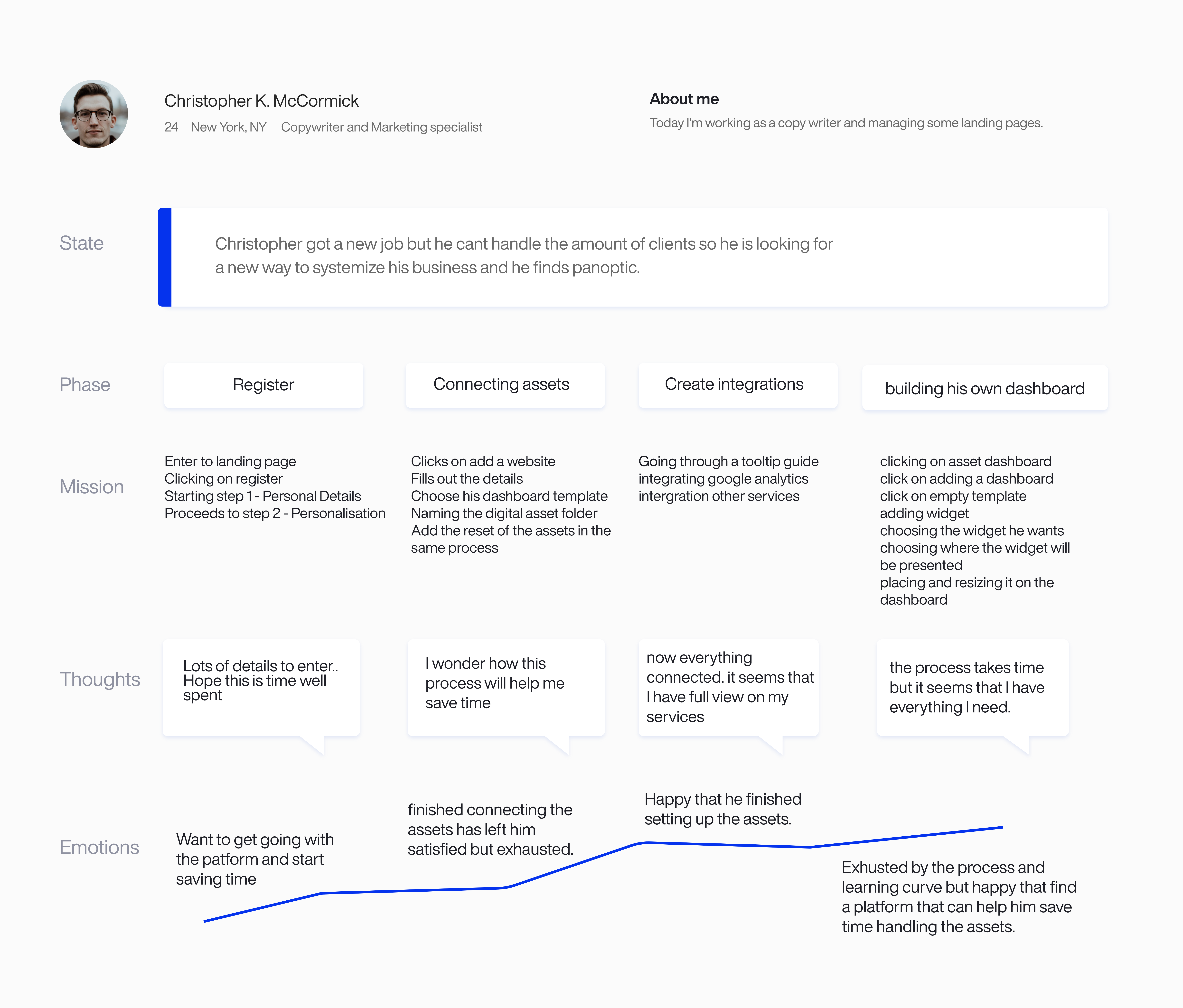
User Journey
I devised a Register user journey. I created a scenario where the user wanted to use the platform to manage
his assets. With this method, I figured that the most crucial step was to enter the asset credentials and
details because it makes the user ask himself questions like “Can I trust them?”, “Do I really need this
service?”.
based on that I decided to design the registration process as simple as I can and create a
trustworthy experience.

Features
This is the list of features I defined for my platform according to my user surveys and interviews and
competitors research.
Those are the main features by title the platform will offer.
Sitemap & Interactions
This is the way I choose to approche my sitemap becuase I really didn't know where the features heiriechy will be and how the user will interact with them.
Sitemap Register
For the register flow I decided to divided it to 4 steps.I tried to define what will be on each steps and
what user decisions he will have.
This is the first brainstorming I had on the platform flow so
things changed in the final design.
Sitemap - Widgets
In this flow I wanted to define which widget services will have intergrations and which one's not.
In this way I can create a welcome dashboard without the user even integration one service
Ideation & Design
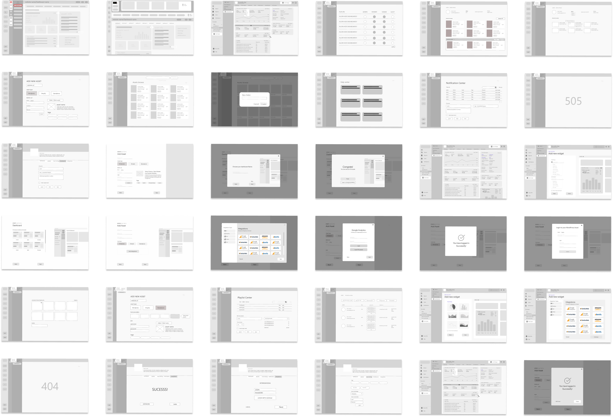
Wireframes
After some sketching, I started my design process by creating low-fidelity wireframes using Adobe XD. The
purpose of my wireframes was to brainstorm and presenting them to my designer's friends.
My top priority was to create an easy way to navigate the dashboard. It wasn't a simple problem to solve
when
I defined three different menus on one screen. I designed more than 3 versions for every screen and more
than
4 versions for dashboard screens.
Eventually, I choose this dashboard version. It allows my user to view all his assets as well as manage and
view his
data easily.


UI DESIGN
I started designing the final High fidelity screens in Adobe XD
Inspired by flat design style and material design elements I created a clean, fresh and corporate look&feel
to the platform.
with this design, the user won't feel overwhelmed by looking at his data.
Tooltip screen
Because I knew that my platform was going to have a lot of menus.
I decided to add a Tooltip flow guide
right after the user finish the register.
That will help the user get familiar with the platform not feeling overwhelmed by the learning curve he
has to go through.
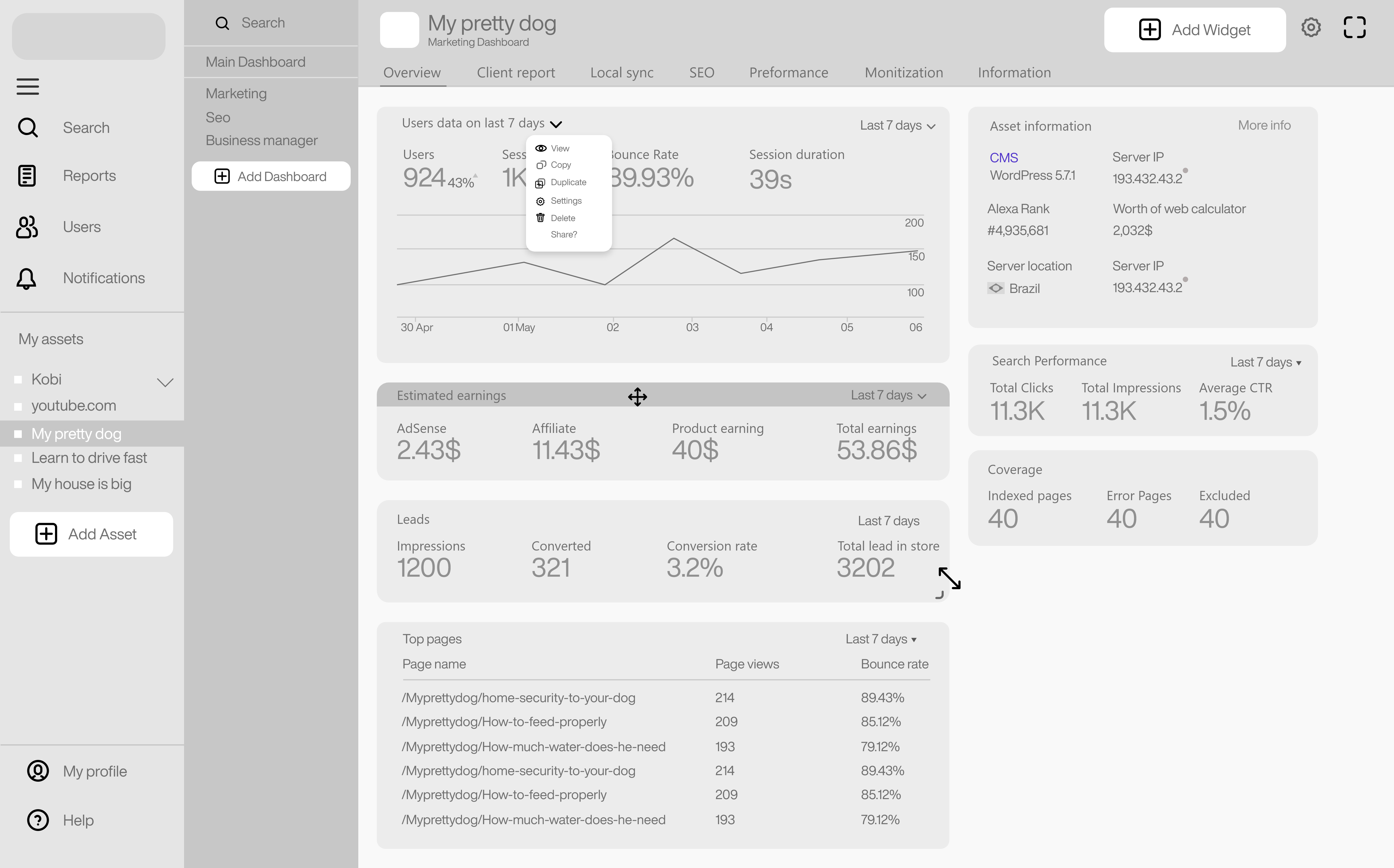
Dashboard Screen
You are looking at a Marketing dashboard screen. In this screen I choose to show the website name on the top
of the screen
along with the dashboard name. Below that you can see the dashboard menu that will contain relative
widgets.
At the side bar I choose to design the list of current digital assets with an option to add one.
The widgets are completly customizable, responsive and movable.
I made the dashboard customizable so the user can prirotize his most important widget as he wants.
Panoptic Mode (Free Dashboard) Screen
This is the panoptic mode screen.
In this screen I wanted to create a free space for the user to create his own ultimite dashboard.
He can view all his widgets for all his assets.
instead of click the add widget button he can just search the widget he want and drag and drop
it on the screen and use it as he likes.
I designed a conditioned notification autmation feature.
The user is able to focus the data he want to get notification about and set a condition he want (IF) then
create the outcome - a list get notifited by phone number or email address
in the example:
IF session duration is under 40s THEN this list get notification.
Register - Step One
I wanted a simple and easy register form to help the user think less. So I split the registration process to
4 steps.
In this way the user is getting more commited to the platform with each step he finish.
I diceded to add some 3d visuals to the screen to support the user excitement of the platform
screen features:
- Password stength Indication
- Wizard form steps idications
- Register with Google or Facebook
Register - Add Asset
In this screen, the user can name his assets, include the asset url address, assign a folder and choose his asset type. After connecting his asset type, he can choose to intergrate his services or just skip to the next step.
Add Widget
In this screen the user is able to add a service widget to his dashboard.
the user procces is:
- Choose or connect his data source (youtube, Google analytics, etc..)
- Select the data type he want the widget to show
- Pick the type of visual the widget will use to display the data
Branding
Brand values
Mission
To be the first platform for efficent digital assets management in a single placeVision
Create more freedom, flexability and powerment in the digital spacePromise
Your assets managedEssense
Actionable fast decisions based on real time dataSlogan
Your assets managedPositioning
digital platforms optimizationVisual Design
Brand personallity
Panoptic is an elegent and intellegent person. He is confident in himself. Stable but also flexible. A person you go to when a problem emerges.
Logo
Colors
Typography
Helvetica Now Display
My Takeaways
During this project, I learned what is best to handle long registration and how critical this flow is. I
learned how to get into the user's minds and understand their personal business and ask the right questions
in order to find their
struggles.
I was presistent and eager to find answers for my UX research even if the questions were too private and
most people didnt want to even sit down with me because they were afriad I would steal their business
secrets or
use it against them.
My biggest fear was to find out that there is no solution to the problem or the problem has already been
solved. But, after some interviews and
overall research, my fears were gone.
This project took nearly half a year to ideate, design, and brand. Many features weren’t displayed in this
case study. there were hundreds and hundreds of screens, designs, and copious amounts of caffeine :) the
project was a huge learning experience for me. Thank you for reading!