NTMS
In this project, I was asked to redesign a B2B workforce tracking service. The service is based on NFC technology. The company's purpose is for medium-large companies that have routine checks like cleaning and checking that need to be done and supervised.
The web application's main purpose was for the routine building managers and supervisors. The mobile application was for the routine workers who mark their work done.
UX UI Designer
2021
Client
The Challenge
Big companies with a lot of maintenance to do have their cleaning teams, inspectors teams, and general maintenance teams. Every team has a manager that relies on their workers to do the job right because he can't be supervising them all. That work takes a lot of resources and manpower in a simple process like cleaning ROOM 421 table or checking if the extinguisher is still in floor 2 hallway.
The Solution
The solution was to design a web application for the managers to track their employee's routines. Along with a mobile app For the employees that checks their work as done by scanning a QR code on the space that needs to be handled.
Define
Webapp Sitemap
At the start of the project, I decided to create a sitemap so I could better understand the user paths and
the platform
structure.
Thereby, I found out some of the necessary pages and popups the client has defined as needed for the
platform is unnecessary and not supporting the usability of the app.
Webapp User flow
I started by mapping out the user's steps to see how I cloud to simplify their journey on the platform.
The most important and probably most used flow for the manager will be editing an existing question in a
group of questions.
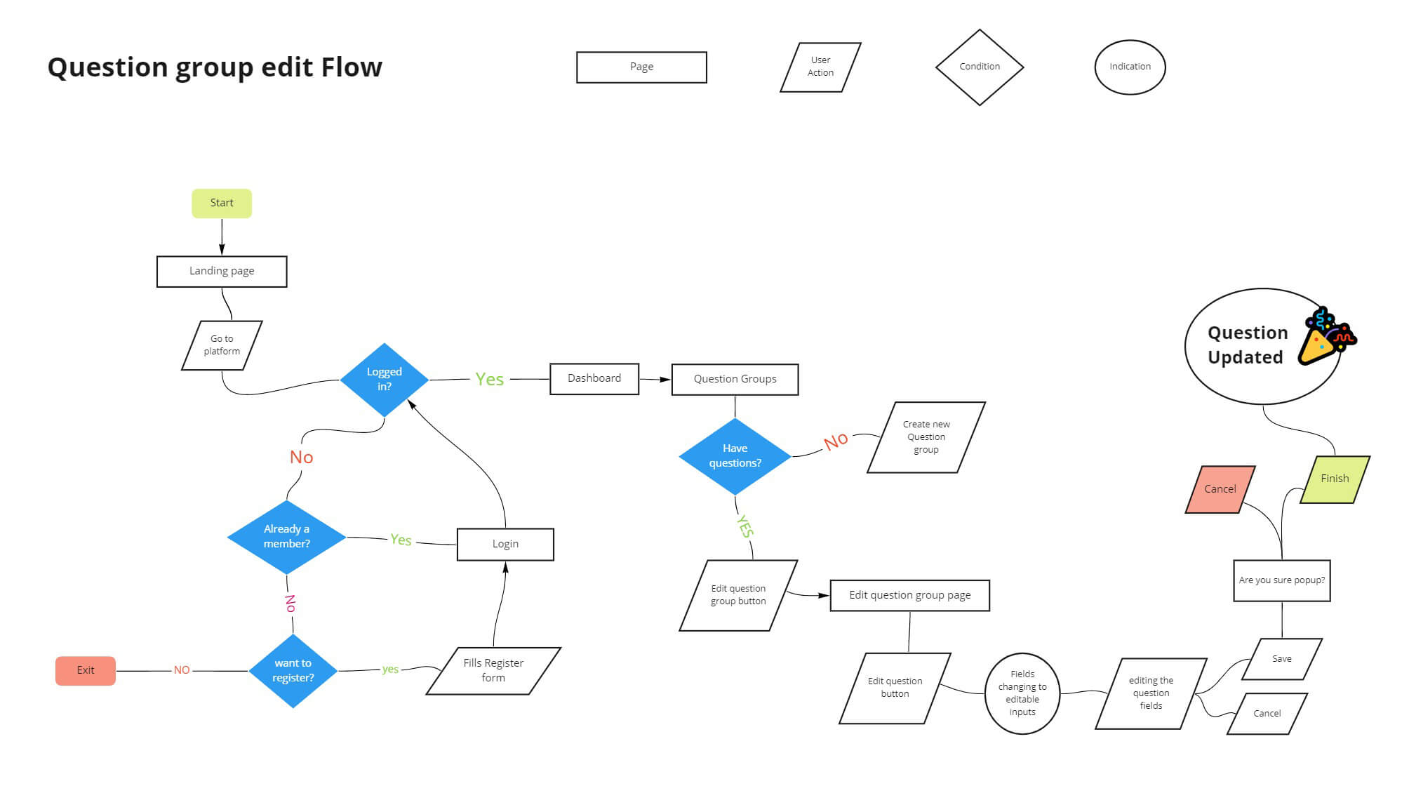 WEBAPP USERFLOW
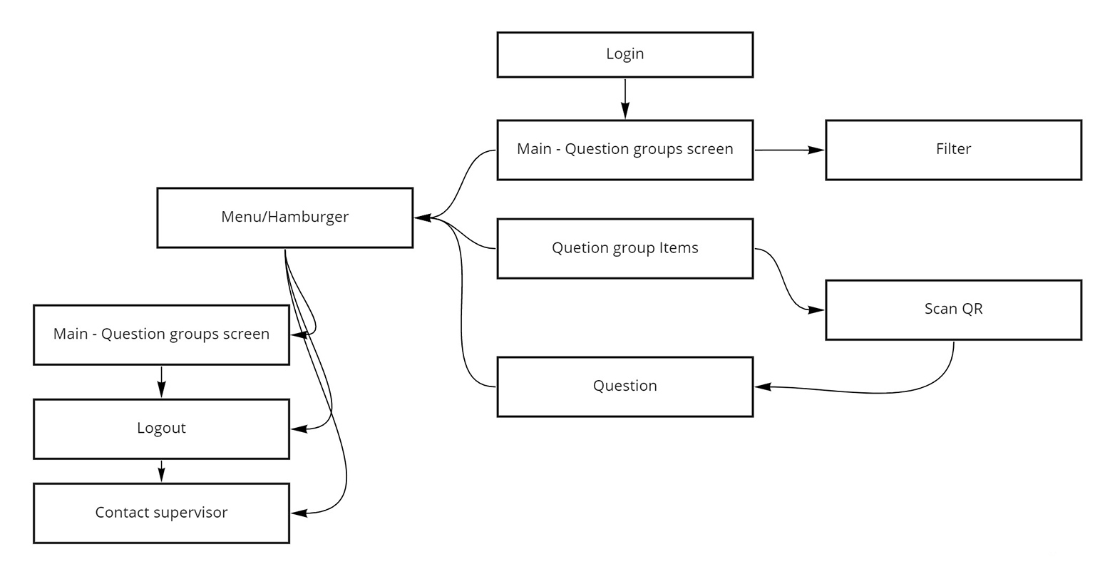
Mobile App Sitemap
I created this sitemap to understand the app structure, hierarchy, and usability.
After getting the app overview I could start trimming the unnecessary pages like scan confirmation.
Mobile App Userflow
I started out with the main userflow in the app. Question filling.
I wanted to understand each step in the way the user will go thourgh in the process in order to make it as
much easy for him to do so.
Using this method I understood which components should appear and in what order in each page.
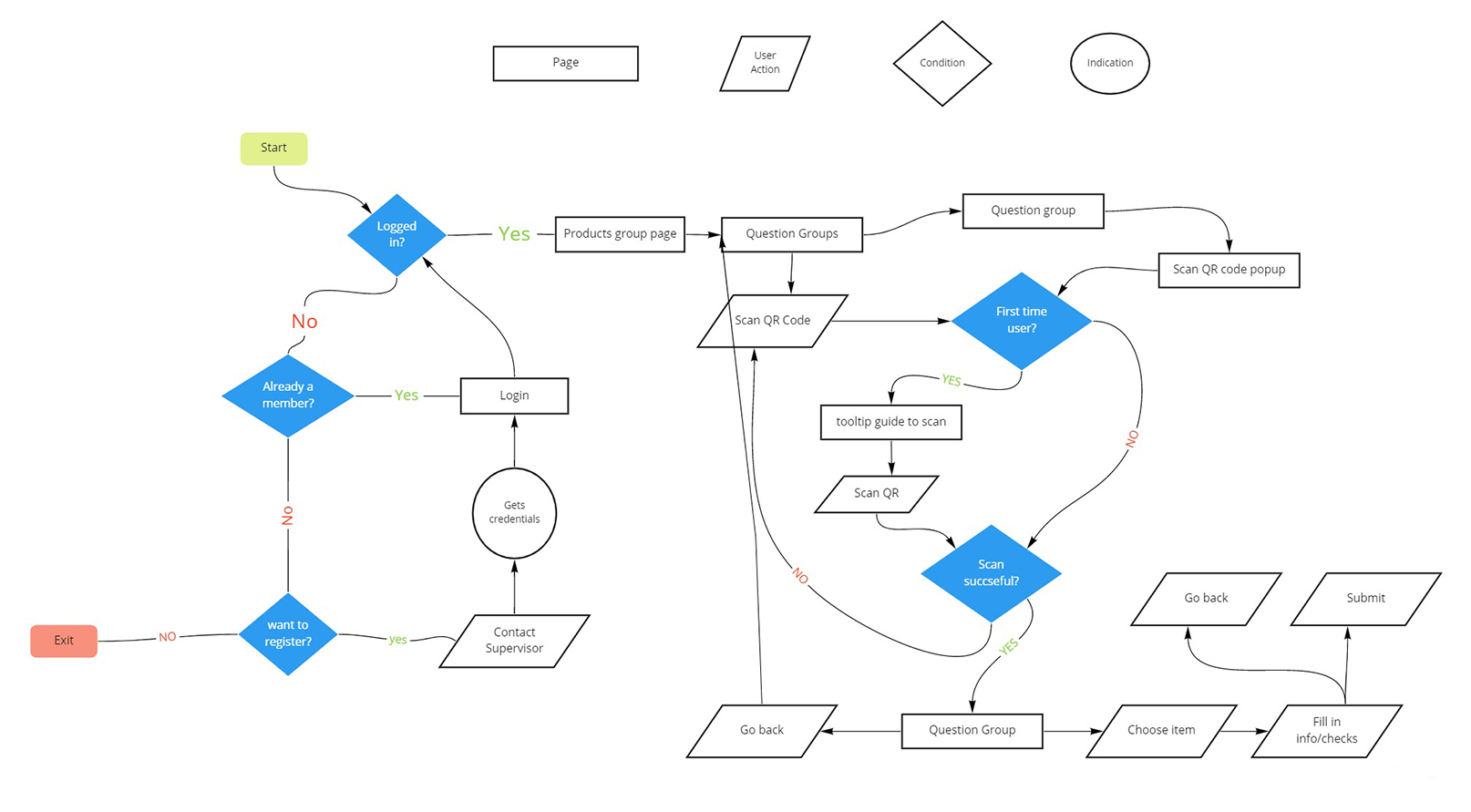 MOBILE APP USERFLOW
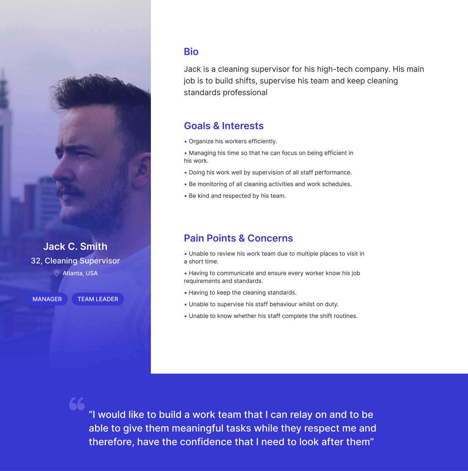
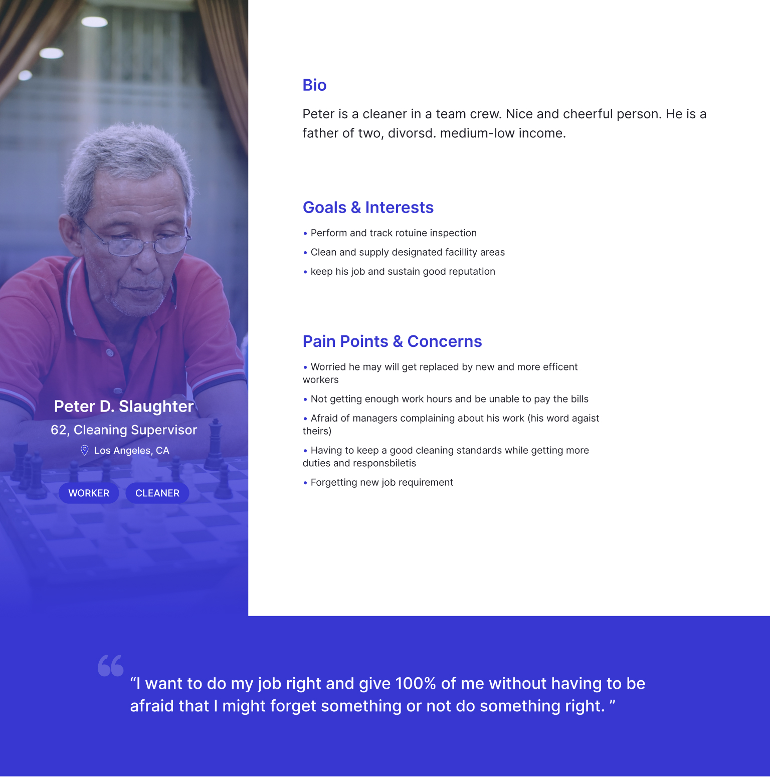
Proto-Personas
Based on the audience research I set up two personas.
I wanted to understand the user needs, goals, and main uses of the app.
I knew one persona will use the desktop web app and one will use the mobile application.
- Cleaning/Any workforce manager
- Worker
Design
Wireframes
At the start of my design process, I created Low-fi wireframes to test different layout styles of the app.
it proves useful because I tested some off-client ideas that I had for the design.
for example, combining the reports search page and results into one single screen.
UI Design
Once my wireframes were explained and tested by the client, I began designing the final screen in high-fidelity
I tried to give it a clean, corporate and light look.
In that way, the managers would not feel overwhelmed by the provided data.
Dashboard Screen
This is the main screen. The first screen the user will see when he logged in to the app.
In this screen I wanted the user to get an overview of his employees and their task accomplishment rates.
I design 2 graphs visible to the user. on the left, you can see a pie graph that gives him an overview of
the last day/week/month.
on the right, he can view the candles graph that has 2 forms of visualization and priorities. He can also
get a comparison of the previous week/month.
Also, I designed a section where the user can filter the tasks by room, product, date, and search.
he
then can access the report of the task.
Dashboard screen B
This is the same dashboard but with the second graph which the user can switch. With this graph, the user can view only the answered questions and not answered questions.
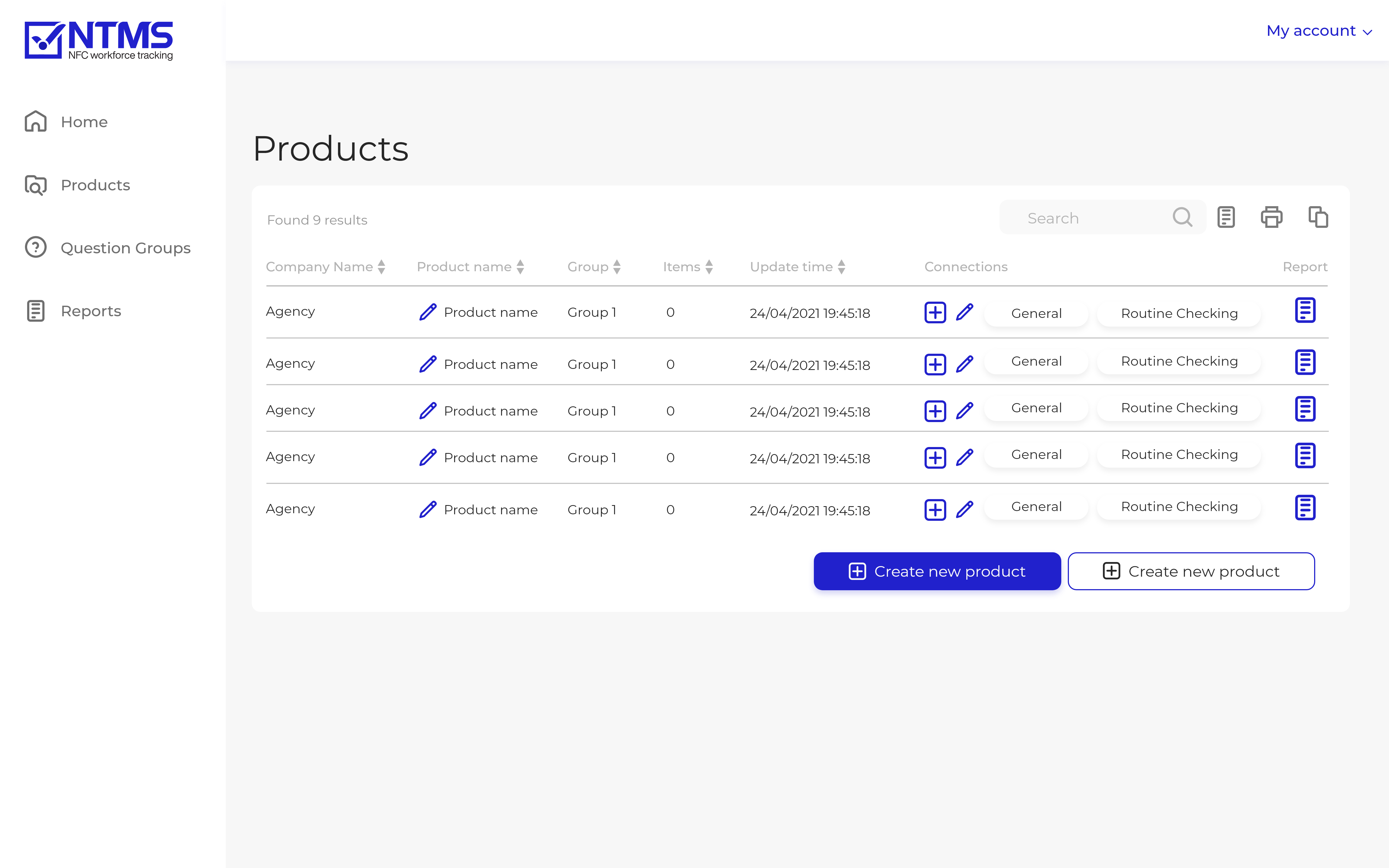
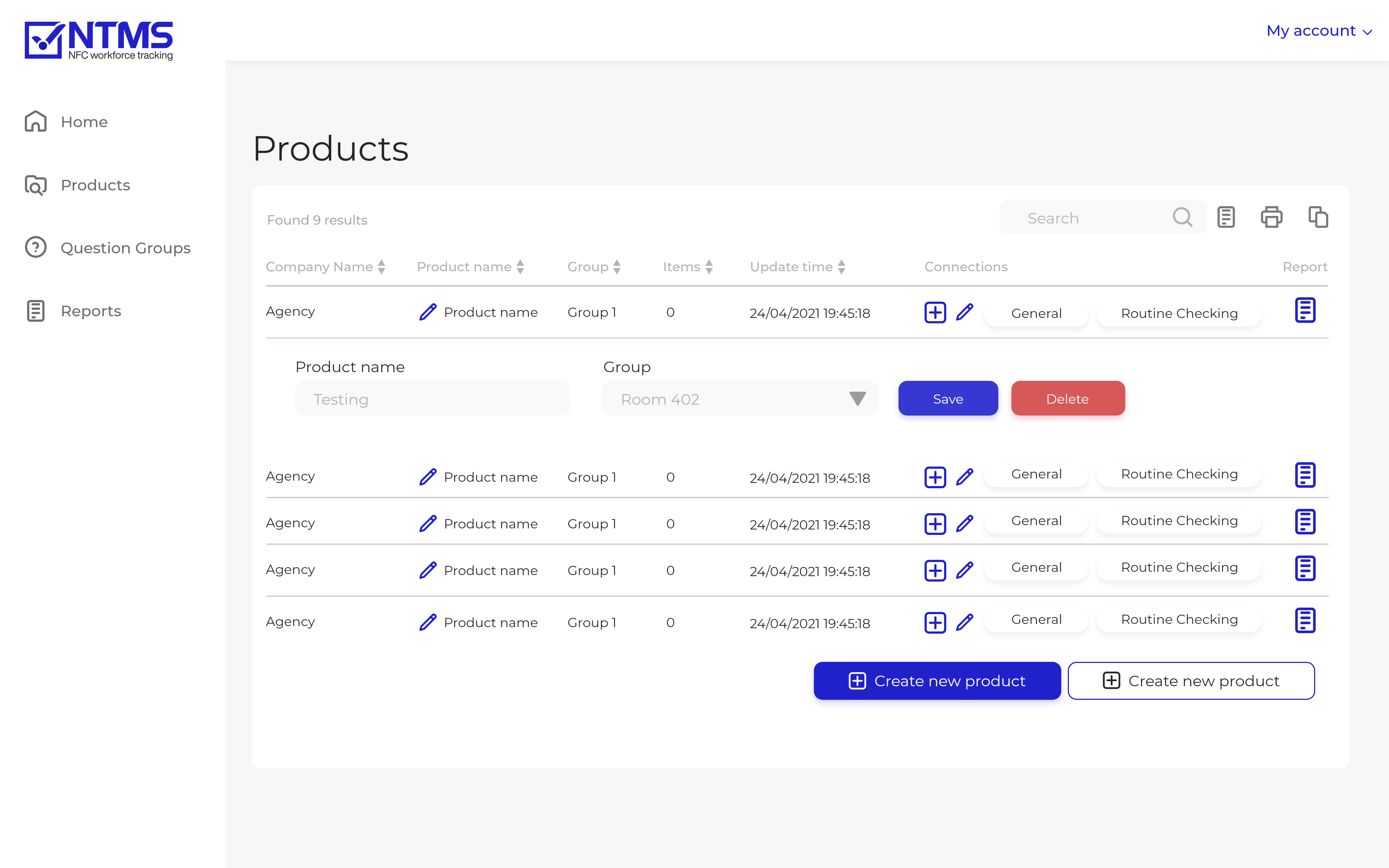
Reports page
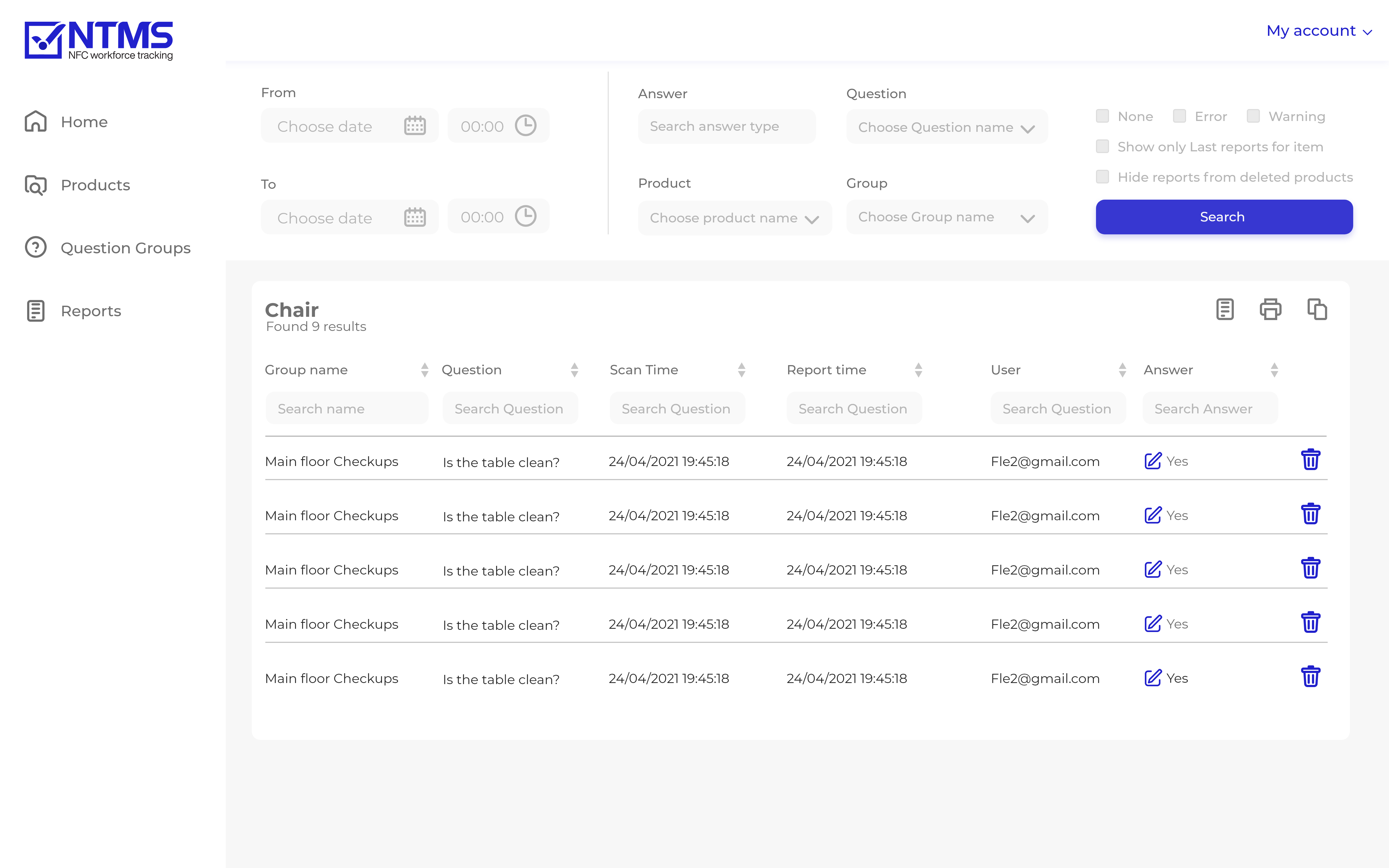
On this page, the user can search reports. He can review their job edit, export to an CVS file, and
delete them.
I've designed the search filters as a drawer so the user can drag move the search so he can focus on the results.
Features on this page:
- Search
- Filter
- Edit answers
- Delete
- Sort
- Export to CSV
Fill question screen
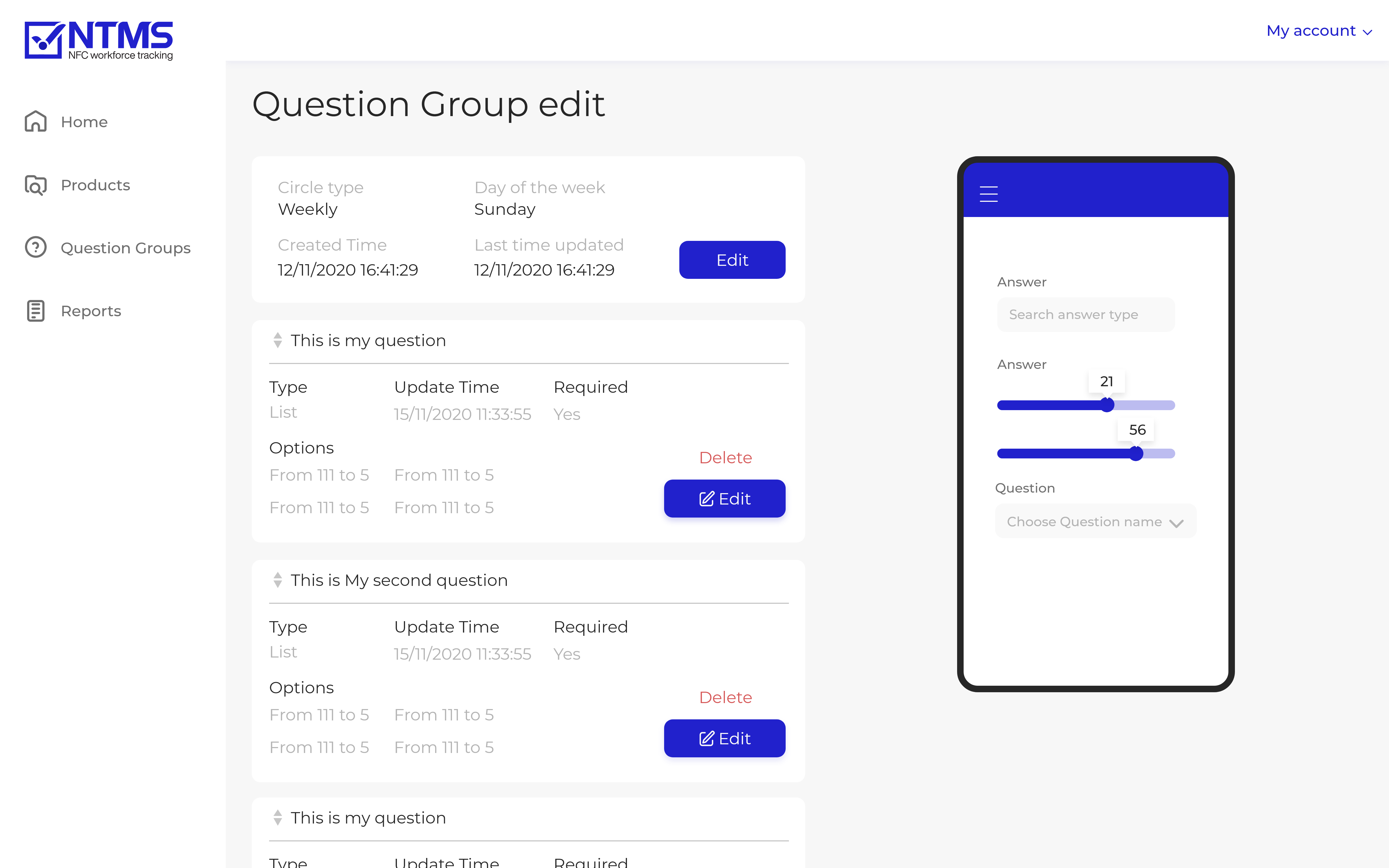
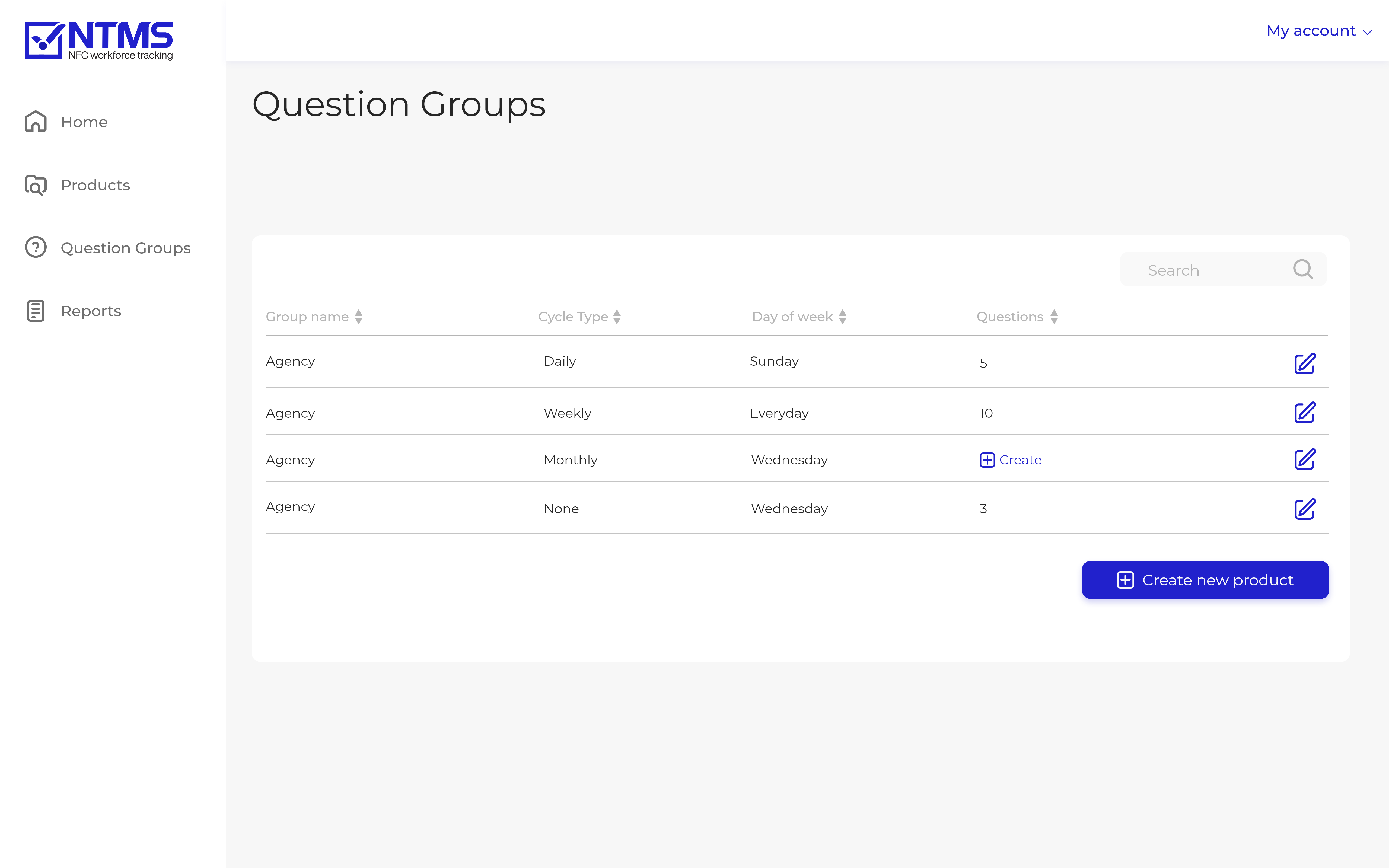
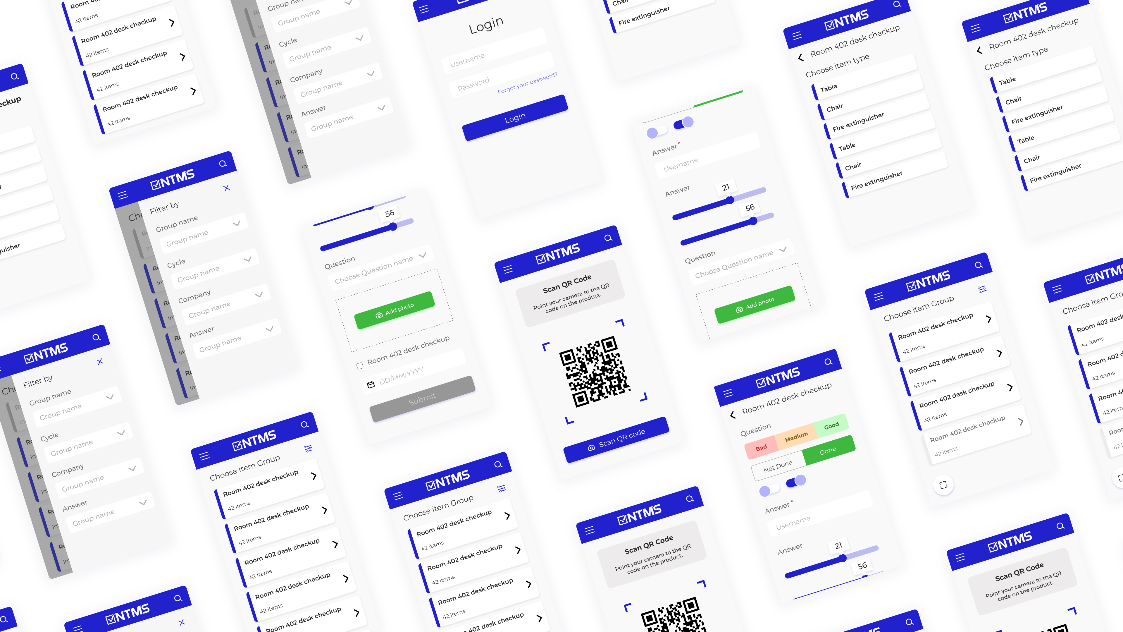
In this screen, I designed all the components types the manager can add to his question group to track his job.
list of components
- Checkbox
- 3 options
- Toggle
- Toggle with text
- Text field
- Slider
- Select answer
- Uplode photo
- Date picker

App main screen
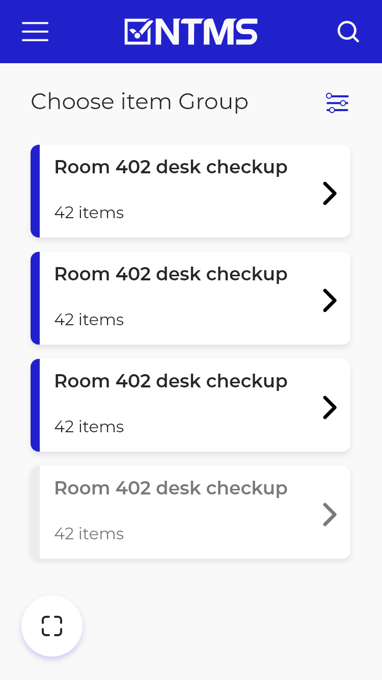
This is the first screen the user will see when logged in.
the user will be able to view his assignment question group that has already been answered and needed to
be answered. And the assisnments he have for to
day.
Routines that already been done is greyed out and go to the end of the list.
The user will not be able to answer the questions without scanning the QR code.
App question fill flow
This is a prototype flow of a new user going through fill out a table question - whether is it cleaned or not.
My Takeaways
In this project, I learned how to manage with a limited budget along with providing the best user experience in the mobile app and desktop web app.
I needed to understand how to transform dull data tables into more appealing tables. That got me to dive deep into the fundamentals of data visualization.
The mobile app was a challenge to design. I had difficulties understanding the user flow and the app uses. It took time for me to comprehend how is best to handle the UI and UX of the app.
to conclude, the project was fun to design. I enjoyed designing and defining it, My client was very understanding and very involved